Don’t miss our Webinar on How to Operationalize Stakeholder Engagement in Energy and Infrastructure Projects.
Wednesday, April 13th. 11am (EDT)
- Our Software
-
Modules
Features
Learn more
Modules
-
- About Us
- Solutions
-
- Pricing
- Resources
Don’t miss our Webinar on How to Operationalize Stakeholder Engagement in Energy and Infrastructure Projects.
Wednesday, April 13th. 11am (EDT)

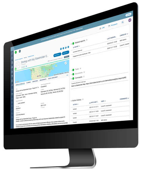
Most engagement teams accumulate a wealth of stakeholder data over the course of a project, but few make full use of it. Borealis Analytics turns your untapped data into clear insights to help you make strategic decisions and better prioritize everyday activities.
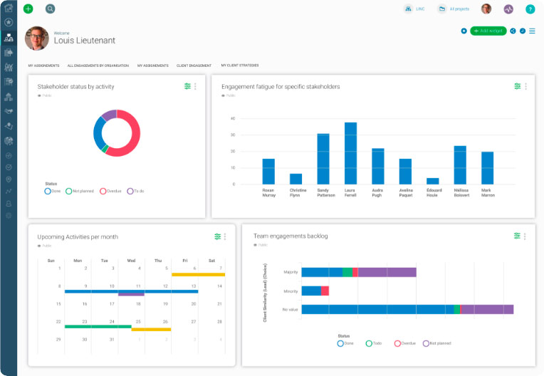
Use dynamic filters to customize the content in maps, graphs or calendars so that you can focus on necessary information. Click on any field to access more detailed information. With Borealis, your stakeholder information is always at your fingertips, ready when you need it.
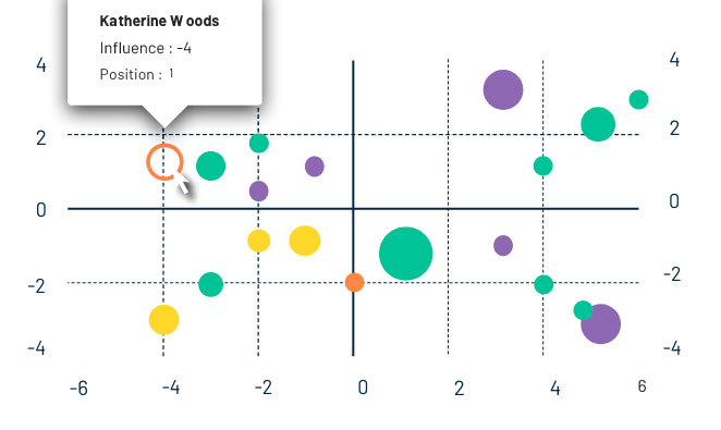
Map your stakeholders based on different criteria to better understand their interests, issues, influence and opinions – and how they’ve changed over time.
Tables


Different types of data are best visualized in different ways. Choose the widget type best suited for your needs.


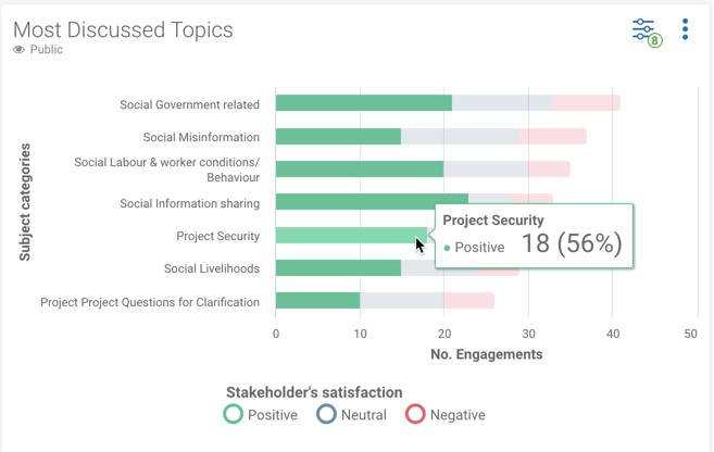
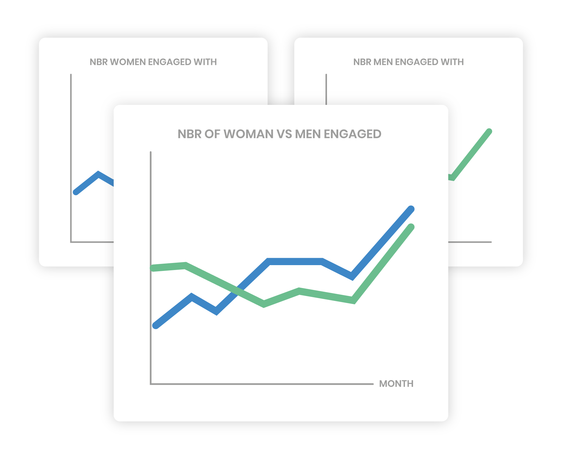
Borealis allows users to combine charts by merging existing widgets or by creating a chart with multiple indicators from scratch. This flexibility makes it easier to interpret data, highlight trends, and ultimately helps users make better, more informed decisions.
Users can combine compatible charts of the following types:
Combined Indicators
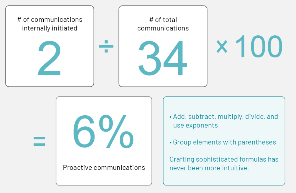
New combined indicator widgets help users get better insights from their data, like what percentage of communications are “Proactive”.
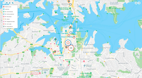
Display data on a map to view stakeholders, engagement activities, issues, and other important information by location (or in relation to corporate assets).
Tables
Build custom tables based on parameters of your choice. Sort and filter your data as needed
Indicators
Define and monitor KPIs to track important indicators, like average grievance resolution time, number of communications per month, and event attendance rate.
Calendars
Add calendars to your dashboards to monitor the progress of planned communications, schedule team meetings, prepare for upcoming events, and even keep track of stakeholders’ birthdays.
Graphs
Different types of data are best visualized in different ways. Choose the widget type best suited for your needs.
Borealis allows users to combine charts by merging existing widgets or by creating a chart with multiple indicators from scratch. This flexibility makes it easier to interpret data, highlight trends, and ultimately helps users make better, more informed decisions.
Users can combine compatible charts of the following types: